The older a console is the less its user interface matters. With the last and current generation, their capabilities have expanded far beyond any system before. Between shopping for games, watching movies, browsing achievements, streaming gameplay and a large number of system settings, creating a functional, smooth and appealing user interface is essential.
Sometimes it’s the little things that help a system menu go the extra mile. The Nintendo DS makes a different chime on your birthday, the PlayStation 2 builds towers based on how much save data you have and a little cat meows tips at you on certain Wii channels.
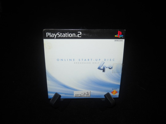
I’m not going to say Online Start-Up Disc 4.0 on PlayStation 2 has the most impressive user interface. It’s clean and functional. But something did catch my eye: when you confirm or cancel a selection, the square boxes in the background ripple a bit.
At first I thought it reacted to any system sound, but unfortunately that’s not true. Either way, it’s nice visual feedback when clicking around. Unless you were frequently switching between network connections, it’s likely you didn’t see this menu too often. I’m a bit surprised at that attention to detail on something very few people would spend more than five minutes with.
The disc also contains CG videos showing how to connect a PlayStation 2 to the internet. Mine is scratched so the voice cuts in and out. It’s likely this voice over was used for another video as it often sounds like chunks of dialog have been removed regarding older system models.
A weird thing to post about, but it’s in my collection.

