From the 38 hours I’ve played of Sword Art Online: Hollow Fragment, it seems like the definition of an average game. The battles are simple, the structure is repetitive, the zones lack compelling designs and excessive enemy placement can slow your progress to a crawl. Yet no single element of Hollow Fragment keeps it from being enjoyable. The one thing that might have stopped me from continuing is that every female character has magnetized breasts that latch onto to the protagonist in cutscenes. Still, outside of the lazy design and fan service, SAO has a unique taste because it’s essentially two games crammed into one.
Hollow Fragment is an original title for PlayStation Vita, but with the content of its previous PlayStation Portable entry, Infinity Moment, rolled into it as well. It’s not a traditional compilation as both exist in the same world side by side. However, each game’s combat areas are separate. After the opening scene, you can progress in either story and jump between them at any point.
Other games have built on their previous entry as a “plus” or “special” version, though they usually try to blend content together to make them feel like one big experience. Despite the shared character and mechanics in Sword Art Online: Hollow Fragment, the two sets of content are designed with their own distinct values.
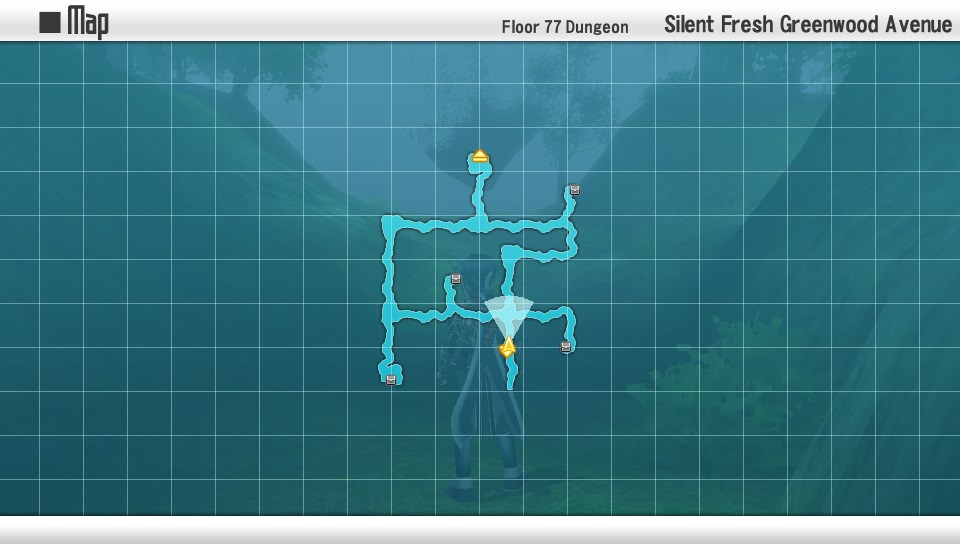
Aincrad, imported from Infinity Moment, is divided into separate “floors.” Each floor’s structure is almost clockwork in its design. To complete one, you always need to clear at least one side quest, defeat a notorious monster and overcome a boss battle. For the nine floors I’ve played through, it’s exactly the same each time. These areas are built for short-term play sessions and quick satisfaction. The self-contained nature of each floor makes it easy to measure progress, which can be achieved with relative ease due to the limited amount of content in them.
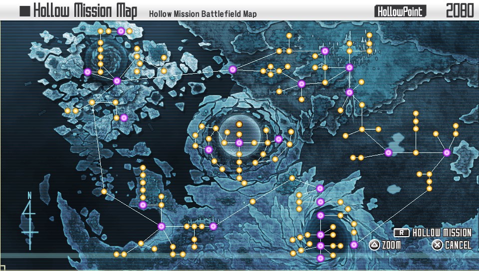
The Hollow Ground is built for longer play sessions and usually has one goal for each expedition. The areas are bigger than Aincrad’s and are interconnected between other zones that make up a larger region. A lot of satisfaction comes from charting a path on the Hollow Map to navigate from one dot to the next
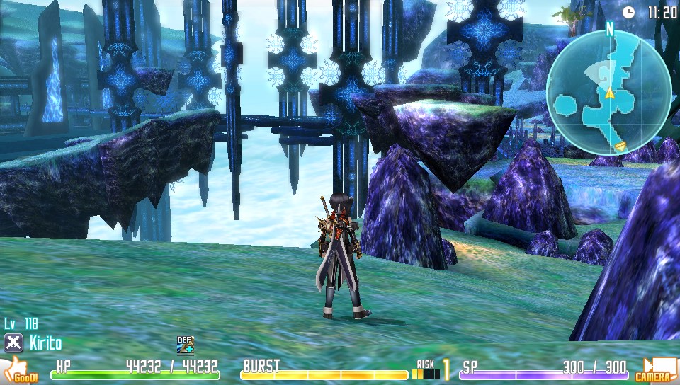
The higher level design of each region is sound. Yet both fail in their execution in the exact same way. Most areas throughout both games are largely made up of corridors and large square rooms that are haphazardly filled with enemies and treasure chests. They’re almost indistinguishable. Spending too much time in one or the other becomes a mind-numbing slog. The Hollow Area has a few places of interest with more complex designs. Nevertheless, these areas are rare treats as the bulk of the remaining are nothing but corridors, corridors and more corridors filled with enemies, enemies and more enemies.
Slapping the two games together seems like a lazy way to go about extending the length of the adventure. However, unlike most other aspects that are dragged down by careless design, it feels like the right choice was made. Being able to jump between two different regions unexpectedly becomes the key to keeping Sword Art Online: Hollow Fragment fun and fresh.





Comments